In today’s fast-paced digital environment, mobile optimization has become a cornerstone of effective marketing strategies. With more than half of global web traffic coming from mobile devices, businesses can no longer afford to neglect the mobile experience. From website design to targeted advertising, ensuring your digital platforms cater to mobile users is essential for driving traffic, boosting engagement, and converting leads.
This article delves into why mobile optimization matters, the key components of a mobile-friendly approach, and actionable tips to enhance your strategy for a mobile-first world.
1. Why Mobile Optimization Is Non-Negotiable in Digital Marketing
The Shift to Mobile-First Behavior

The rise in mobile usage has been transformative. Consumers now rely on smartphones for browsing, shopping, and social media interactions. As a result, a poor mobile experience can significantly impact a brand’s credibility and bottom line. According to Google, 61% of users are unlikely to return to a mobile site they found difficult to use, and 40% will visit a competitor instead.
Mobile optimization ensures that users can easily navigate your site, view content, and complete actions like making a purchase or signing up for services. Brands that prioritize mobile responsiveness not only retain existing customers but also attract new ones by meeting their expectations for convenience and speed.
SEO and Mobile-Friendliness
Google’s mobile-first indexing means that the search engine primarily uses the mobile version of a site to determine rankings. This change underscores the importance of optimizing your site for smaller screens. Mobile-friendly websites tend to rank higher in search results, making them more visible to potential customers.
Neglecting mobile optimization could lead to lower search rankings, decreased visibility, and a significant drop in organic traffic. A seamless mobile experience is now directly tied to a brand’s ability to compete in the digital space.
2. Key Elements of an Effective Mobile Optimization Strategy
Responsive Web Design
Responsive design ensures your website adapts to different screen sizes, offering a consistent experience across devices. This approach eliminates the need for separate mobile and desktop versions, streamlining maintenance and improving user experience.

With responsive design, content automatically adjusts to fit the screen, ensuring readability and usability. This includes scalable text, resizable images, and intuitive navigation menus. Investing in responsive design enhances accessibility and keeps users engaged, regardless of the device they’re using.
Page Load Speed
Mobile users demand quick results. A delay of even a few seconds in page loading can lead to high bounce rates and lost opportunities. Tools like Google PageSpeed Insights can help identify performance issues and suggest improvements.
Optimizing images, enabling browser caching, and minimizing code can drastically improve load times. Additionally, using a content delivery network (CDN) can ensure faster loading speeds by delivering content from servers closest to the user.
Simplified Navigation
Mobile screens are smaller, making intuitive navigation crucial. Clear menus, easy-to-tap buttons, and logical page layouts can help users find what they need without frustration.

Implementing features like collapsible menus and a prominent search bar can further enhance usability. Ensuring that all clickable elements are spaced appropriately reduces accidental clicks, improving the overall experience.
3. The Role of Mobile Optimization in Conversion Rates
Enhanced User Experience
A mobile-optimized website eliminates barriers to action. Whether filling out a form, purchasing a product, or subscribing to a newsletter, users are more likely to complete these tasks when the process is seamless.
For e-commerce businesses, mobile optimization can directly impact sales. Simplifying the checkout process, offering mobile payment options, and ensuring secure transactions build trust and encourage purchases.
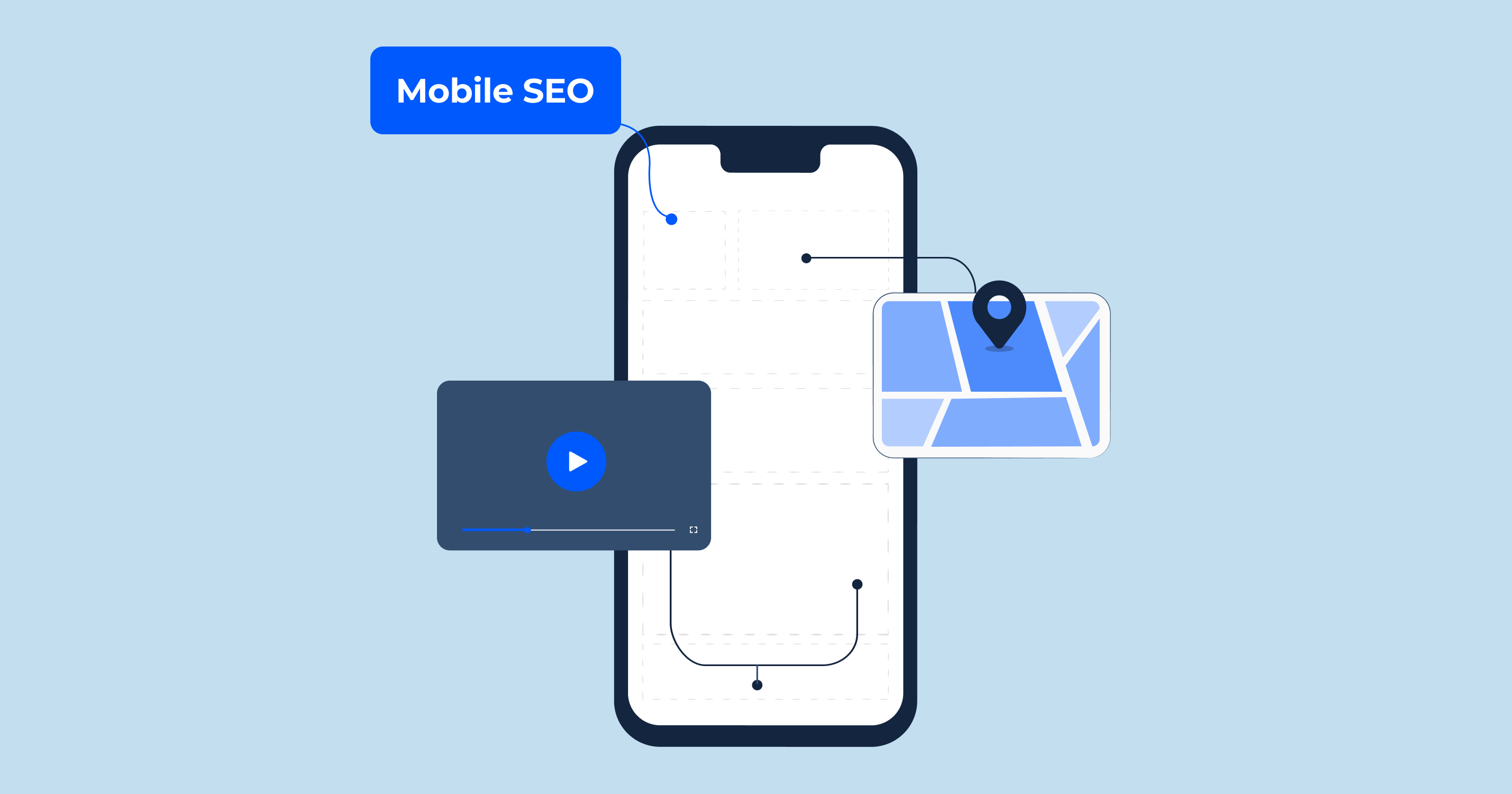
Local SEO Benefits
Mobile optimization is particularly important for local businesses. Many mobile searches have local intent, such as “near me” queries. Ensuring your website is mobile-friendly increases your chances of appearing in local search results and Google’s Local Pack.

Including accurate contact information, clickable phone numbers, and a map of your location enhances the experience for on-the-go users. These features make it easier for potential customers to connect with your business and take immediate action.
4. Common Mobile Optimization Pitfalls to Avoid
Overlooking Mobile-Specific Content
Mobile users often have different needs compared to desktop users. Failing to tailor content for mobile consumption can result in disengagement. For example, lengthy paragraphs and large blocks of text can overwhelm users on smaller screens.
Focus on concise, scannable content with clear headings and bullet points. Visual content, such as videos and infographics, can also capture attention and convey information effectively.
Ignoring Mobile Analytics
Many businesses analyze desktop traffic but fail to assess mobile performance. Without mobile-specific insights, it’s challenging to identify issues or opportunities for improvement.
Regularly reviewing mobile analytics can reveal user behavior patterns, high-exit pages, and potential obstacles. Use these insights to fine-tune your mobile strategy and enhance the user journey.
5. Steps to Optimize Your Mobile Strategy
Conduct Regular Mobile Audits
A comprehensive audit can uncover technical and usability issues affecting your mobile performance. Tools like Google’s Mobile-Friendly Test can help identify areas for improvement.
During audits, pay attention to factors such as load times, design responsiveness, and ease of navigation. Addressing these issues promptly ensures a consistently positive experience for mobile users.
Focus on Mobile-First Content

Develop content with mobile users in mind. Use attention-grabbing headlines, concise text, and engaging visuals to deliver your message effectively. Ensure that videos and images are optimized for mobile playback without compromising quality.
Interactive content, such as polls or quizzes, can further enhance engagement and encourage users to spend more time on your site.
Conclusion
Mobile optimization is no longer an optional feature but a critical component of successful digital marketing strategies. By prioritizing responsive design, fast loading speeds, and user-friendly navigation, businesses can enhance user satisfaction and drive meaningful results. Moreover, the impact of mobile optimization extends beyond usability—it directly influences SEO rankings, conversions, and local search visibility.
To stay competitive, it’s essential to adapt to the mobile-first landscape and continuously refine your strategy based on analytics and user feedback. Ready to elevate your digital presence? Explore our blog for more insights, share your thoughts in the comments, and subscribe to stay updated on the latest trends. Let’s make your brand mobile-friendly together!
Leave a Reply