
In today’s digital age, mobile optimization has become a cornerstone of successful marketing strategies. With more people relying on smartphones and tablets to browse the internet, businesses must ensure their websites and content perform seamlessly across mobile devices. Mobile optimization isn’t just about creating a responsive website—it’s about enhancing user experience, boosting search engine rankings, and driving conversions.
In this article, we’ll explore why mobile optimization is crucial for digital marketing, highlight best practices, and discuss its impact on customer engagement and business growth.
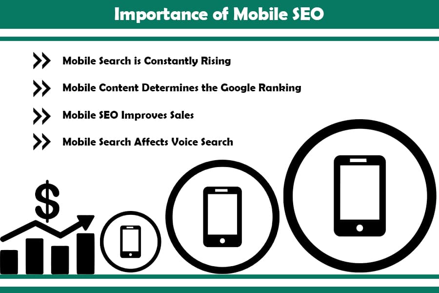
1. The Rise of Mobile Usage in the Digital Landscape

A Mobile-First World
Mobile devices have surpassed desktops as the primary tools for internet browsing. According to recent statistics, over 60% of web traffic now originates from mobile devices. This shift has compelled search engines like Google to adopt mobile-first indexing, meaning a website’s mobile version is prioritized for ranking purposes.
Businesses that fail to optimize for mobile risk losing significant traffic and potential customers. From slow-loading pages to unresponsive designs, poor mobile experiences can lead to high bounce rates and decreased engagement. Conversely, a well-optimized mobile presence ensures users can easily access and interact with content, regardless of the device they use.
Enhancing Accessibility and User Experience
Mobile optimization goes beyond aesthetics. It’s about delivering a seamless browsing experience that caters to the unique behaviors and preferences of mobile users. Features like intuitive navigation, touch-friendly interfaces, and fast-loading pages are critical for keeping visitors engaged and encouraging them to explore further.
2. The Role of Mobile Optimization in SEO
Boosting Search Engine Rankings
Search engines prioritize mobile-friendly websites in their results, making mobile optimization a key factor in SEO strategies. Sites that are not mobile-optimized are penalized, resulting in lower rankings and reduced visibility. Features like responsive design, mobile-specific meta tags, and optimized images help improve rankings and attract organic traffic.
Incorporating mobile-friendly elements also enhances site speed, a critical ranking factor. Mobile users expect pages to load within three seconds, and delays can lead to lost visitors. Optimized websites not only improve speed but also create a positive impression that encourages repeat visits.
Local Search Optimization
Mobile optimization plays a significant role in local SEO. Mobile users frequently search for nearby businesses, services, and products on the go. Features like location-based keywords, clickable contact information, and integrated maps make it easier for users to find and connect with your business. Ensuring mobile readiness helps capture this audience and drives foot traffic to physical locations.
3. Mobile Optimization and Customer Engagement
Capturing Attention with Mobile-Friendly Content
Mobile users often consume content differently than desktop users. Bite-sized information, clear visuals, and easy-to-read text are essential for capturing attention. Optimized videos, images, and infographics enhance the appeal of your content, making it more shareable and engaging on platforms like social media.
Interactive features, such as swipeable galleries or mobile-specific calls-to-action, further encourage user interaction. By prioritizing mobile-friendly formats, businesses can create a personalized and engaging experience that keeps visitors coming back.
Building Trust and Loyalty

A seamless mobile experience reflects professionalism and reliability. Users who encounter frustrating navigation, illegible text, or unresponsive features are less likely to trust your brand. On the other hand, a polished and functional mobile website fosters trust, encouraging users to stay longer, explore more, and ultimately convert.
Mobile optimization also supports a consistent brand experience across devices. Whether users access your site from a phone, tablet, or desktop, ensuring cohesive design and functionality builds familiarity and strengthens loyalty.
4. Best Practices for Effective Mobile Optimization
Implementing Responsive Design

Responsive design is the foundation of mobile optimization. It ensures your website adjusts automatically to fit different screen sizes, delivering a consistent and user-friendly experience. From flexible grids to scalable images, responsive design minimizes the need for separate mobile and desktop versions, simplifying maintenance and improving efficiency.
Prioritizing Page Speed
Speed is critical for mobile users. Compressing images, leveraging browser caching, and minimizing unnecessary scripts can significantly reduce load times. Tools like Google’s PageSpeed Insights can help identify and address speed-related issues, ensuring your site performs optimally on all devices.
Optimizing for Touchscreen Navigation
Mobile devices rely on touch-based navigation, making clickable elements crucial for usability. Buttons should be large enough to tap easily, while menus should be simplified to accommodate smaller screens. Intuitive gestures, such as swiping or pinching, enhance user interaction and make browsing more enjoyable.
5. Measuring the Impact of Mobile Optimization
Tracking Performance Metrics

Measuring the success of mobile optimization requires monitoring key performance indicators (KPIs). Metrics like bounce rates, session duration, and conversion rates provide insights into user behavior and highlight areas for improvement.
Tools like Google Analytics offer mobile-specific reports, helping businesses assess how well their mobile strategies align with user expectations. By analyzing these metrics, brands can make informed decisions to enhance their mobile experiences.
Staying Ahead with Regular Updates
Mobile technology evolves rapidly, and staying current is essential for maintaining competitiveness. Regular updates, testing across devices, and adapting to emerging trends ensure your website remains relevant and functional. From integrating voice search to optimizing for 5G speeds, proactive optimization keeps your brand ahead of the curve.
Conclusion
Mobile optimization is no longer optional—it’s a necessity for any brand looking to thrive in the digital marketing landscape. By prioritizing mobile-friendly designs, improving site speed, and catering to the unique needs of mobile users, businesses can enhance engagement, boost SEO rankings, and drive meaningful conversions.
Curious about optimizing your mobile presence? Explore our other articles for actionable tips, share your thoughts in the comments, and subscribe to our newsletter for the latest insights. Let’s work together to create a seamless mobile experience that keeps your audience coming back for more!
Leave a Reply